UI is an Optimization Problem
Posted: October 29, 2011
I was talking to a co-worker who recently read some of the site. As an aside, thanks so much to anyone who reads this. As to the co-worker, I can’t thank you enough for giving solid feedback, it means a lot. What came from that conversation, was the implication that it’s hard to browse the blog content.
How It Happened
Reading the blog itself was never my prime concern. Effective UI design is ultimately an optimization problem. In this case I optimized interaction with the static content; the professional, games, and utilities sections.
All that CSS for navigation and the hub pages, exists to support looking up my portfolio items in a clean way. I’m still surprised that it all looks great by default on iOS. That part is rock solid.
The Solution
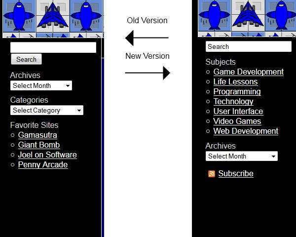
After some thought on how to solve this problem, I’ve decided on this:

The old version gave you the ability to find something you knew existed, but was otherwise quite disorganized. I went back and realized I have over 50 posts on here. Unless you go digging you won’t know what the site’s even about.
To fix this, the categories are now the important item. I’ve done an overhaul of the categories in an attempt to simplify things for a new user. When coming to the site, you will see a simple list of what I write about. The Archives are still there if you want them, but aren’t the main focus.
Conclusion / TLDR
Make sure you pay attention to the usability of every feature of a site or app, regardless of whether you think that feature is going to be used. My assumption was that this is a portfolio site, so I chose to optimize for the experience of finding my past work. I hadn’t even thought about the blog aspect. The new version will hopefully make the reader clear on what I cover.